Great event brands sell scale and emotion in the same breath: thousands of seats, lights on the field, and artists who belong on the marquee. Select Artists Associates positions itself as the partner that brings those worlds together—turnkey concerts inside venues where game-day precision still matters. The live site at selectartists.com carries that story before you scroll: one coherent promise, backed by photography that feels like the product itself.
The hero is a system—not a pretty picture dropped on top
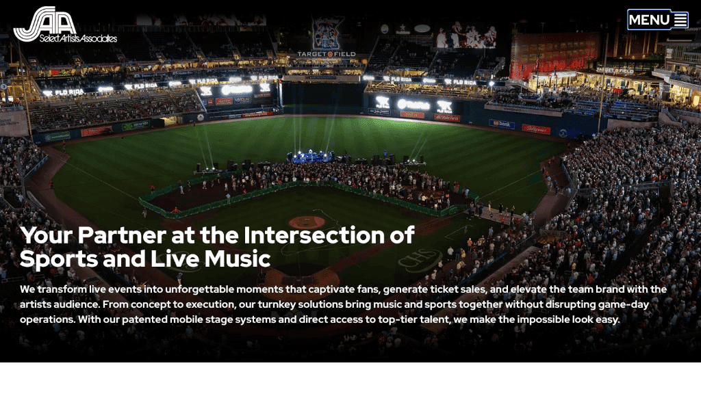
The screenshot above is a textbook example of orchestrated hero design. A single, wide photograph establishes credibility (packed stadium, stage on the field, energy you can feel). A dark gradient sits between that photo and the foreground so white type stays readable without flattening the scene into mud. The SAA mark reads cleanly in the corner; navigation stays minimal—a framed “Menu” control—so attention stays on the story instead of a crowded bar of links.
That combination—photography, overlay, logo, restraint in chrome—is deliberate. It mirrors how SAA works in real venues: maximum spectacle with disciplined operations underneath. When design and content teams align on that idea, the homepage stops being decoration and becomes proof.
Typography and message: one headline, many jobs
The headline on the live hero—“Your Partner at the Intersection of Sports and Live Music”—does heavy lifting in a few words. It names the category (sports venues + concerts), the relationship (partner, not vendor), and the overlap (intersection) without jargon. Large, bold sans-serif type gives it authority; generous line length in the supporting paragraph lets the value proposition breathe—turnkey execution, respect for game-day flow, patented mobile stage systems, access to top-tier talent.
Typography here is not font shopping—it is hierarchy. The eye moves from headline to explanation to proof points because size, weight, and spacing were chosen together. Weak sites swap fonts for novelty; strong sites pick one family (or a tight pair) and use scale and contrast so scanning works on a phone in a noisy venue lobby.
Imagery that earns the fold
A stadium-at-night photograph is a high-risk, high-reward asset. Risky because full-width photography can blow file budgets and slow the first paint; rewarding because nothing communicates “we belong on this stage” faster than the stage itself. The image choice reinforces trust: this is not stock ambiguity—it reads as major-league scale and production discipline.
For marketers, the lesson is simple: the biggest image on the page should earn its megabytes by carrying brand truth. For builders, the parallel lesson is to pair that asset with modern formats, responsive sizing, and caching so the emotional punch does not convert into abandoned visits.
The dark overlay between photo and type is also an accessibility win: white headlines stay legible against detail-heavy skies, crowds, and ribbon boards—without turning the photography into a gray mush. That balance matters for sponsors skimming on phones between innings as much as it matters for brand polish on a desktop pitch deck.
A compact menu treatment (icon plus label, tucked in a simple frame) keeps the chrome quiet—a mobile-friendly habit that preserves the hero as the emotional center on small screens as well as large ones.
Where hosting meets rankings and real visitors
Search engines and humans agree on one blunt fact: slow pages lose. Google’s public focus on Core Web Vitals—metrics tied to loading, interactivity, and layout stability—means large heroes and rich layouts must load efficiently or risk weaker signals for quality. Independent studies have long tied faster experiences to better engagement; Google’s own documentation treats vitals as part of how “page experience” shows up in results—so marketing teams should treat speed as part of the brief, not only an engineering ticket.
That does not mean shrinking ambition; it means delivery discipline: compress and resize imagery for each breakpoint, serve assets through a CDN so geography does not punish fans across the country, and keep time-to-first-byte honest with hosting that is not oversubscribed.
Better hosting and edge delivery do not replace great design—but they protect the investment in photography and copy. When Largest Contentful Paint (often that hero image) arrives quickly and text does not jump while fonts load, visitors stay for the story you wrote. Search systems increasingly treat those experience signals as inputs alongside classic relevance—so craft and performance belong in the same conversation.
If you are auditing your own property, our plain-language guide when “good enough” hosting becomes a bottleneck walks through early fixes—CDNs, regions, HTTPS, backups—that pair well with a marketing site built to impress at first glance.
The takeaway
Select Artists Associates shows how imagery, typography, and narrative can feel inevitable when they share one brief: prove scale, prove calm execution, and invite the next conversation. The web experience should feel as intentional as the event on the field—visually bold, texturally rich, and technically solid enough that neither fans nor algorithms bounce early.
If you are orchestrating a flagship marketing site and want the same clarity—from hero design through hosting posture—we would love to hear what you are building next.