Nighthawk Flight Systems builds primary flight displays and avionics aimed at affordability, safety, and reliability. On the web, that story has to land in seconds—often for pilots, operators, and partners who are scanning between meetings or on the hangar floor. The homepage screenshot above shows how the brand solves that: show the product clearly, say what is new, then invite the next click.
One hero, two roles: prove it, then explain it
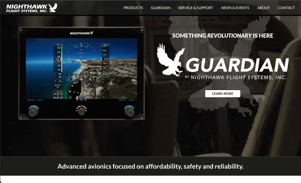
The hero uses a familiar split layout. On one side, a sharp photo of the Guardian display—bright symbology, synthetic vision, the kind of detail experts look for. On the other, short teaser copy (“Something revolutionary is here”), the Guardian wordmark with Nighthawk attribution, and a single Learn More button. Your eye reads product first, brand second, action third. That order respects both audiences: technical buyers who want evidence and newcomers who need a clear entry point.
Behind the text and device shot, a softened cockpit photograph adds context without competing—depth instead of clutter. A faint hawk silhouette ties the emotional layer back to the logo so the page feels designed, not templated.
Design choices that signal precision
Dark backgrounds and high-contrast white type read “instrument panel,” not “marketing fluff.” Clean, uppercase navigation fits an industry where labels are exact and habits matter. The bottom banner line—“Advanced avionics focused on affordability, safety and reliability”—restates the promise in plain language after the drama of the hero. Small touches like that reduce bounce: even a quick scroll tells you what the company values.
Turning depth into a simple site map
Avionics companies ship manuals, service bulletins, product sheets, and training material—often spread across teams. A strong marketing site does not replace those assets; it organizes the front door so people find the right door quickly. The top navigation on nighthawkfs.com labels that journey in everyday words: Products for what you can buy, Guardian for the flagship line, Service & Support when something needs attention, News & Events for what changed, About for the company story, and Contact when it is time to talk.
That structure keeps technical depth from turning into a maze. Visitors choose their job-to-be-done—research, service, or partnership—and the site mirrors it. When documentation and support content live behind clear labels, phone calls and emails go down because the path is obvious.
Why experience and hosting both matter
Trust in aviation products starts with clarity and follows through to reliability. A site that loads steadily on mobile, stays available during news spikes, and keeps forms working is part of that story. CrownInternet.ai hosts and operates the environment behind nighthawkfs.com so the public face stays as dependable as the messaging—if you want a plain-language checklist for when hosting becomes the weak link, see this guide.
The takeaway
Good B2B sites do not shout—they orient. Nighthawk’s homepage pairs proof (the display), brand (Guardian + hawk), and a calm path forward (Learn More + structured navigation). That is how you honor complex products without burying visitors in jargon.
If you are planning a similar balance—technical credibility with a friendly first click—we would love to hear about your next launch.